
Logo Presentation
In this round of logos, we focused on the logo text and moved away from the logo mark. We looked for opportunities in color and shifting flow across the text with teals, blues, purples, and charcoals. These logos show a great melding of strength and beauty that embodies your creativity and expertise.
Page Contents
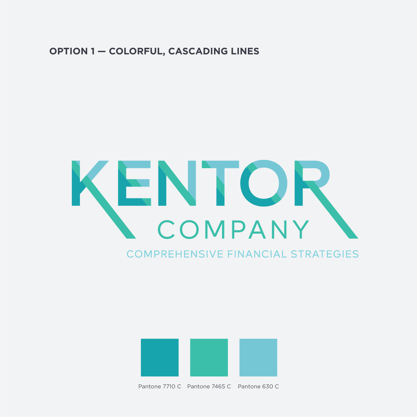
Option 1 — Colorful, Cascading Lines
In Option 1, we took advantage of the cascading nature of the “K,” “R,” and “N” to host a beautiful color palette of light greens and teal. The offset design creates energy and draws the eye across the extended glyphs.
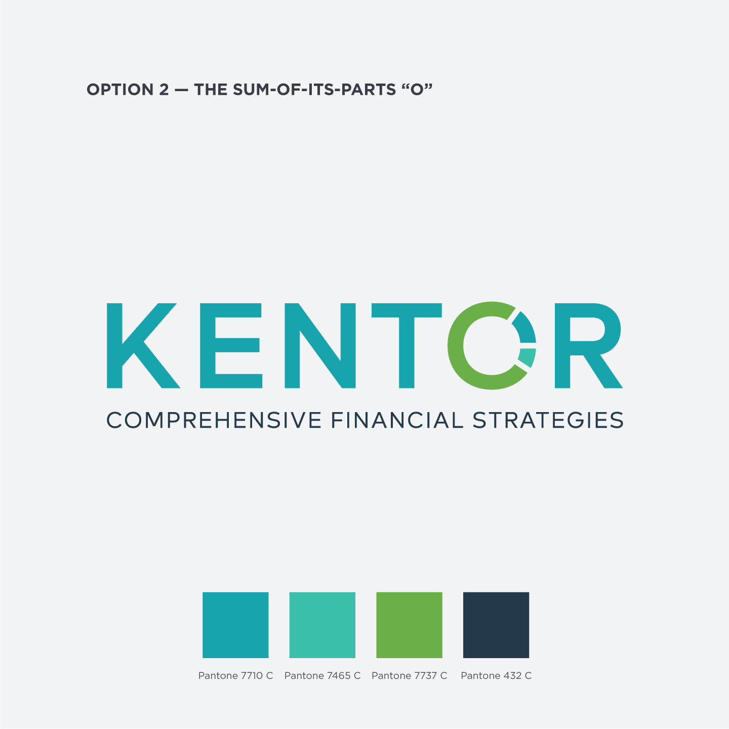
Option 2 — The Sum-of-its-parts “O”
To show a collection of parts coming together in this option, we’ve used the “O” as an opportunity for a gradient of color and parts coming together in a continuous circle. The colors are a bit bolder to really separate the parts.
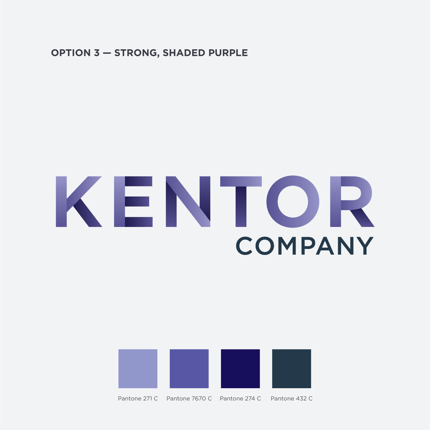
Option 3 — Strong, Shaded Purple
Though purple can often be a softer option, this beautifully shaded option creates a strength and subtlety that will work well in your industry. Partnered with a deep charcoal in “Company,” your eyes are drawn to the Escher-esque lines the gradients create.
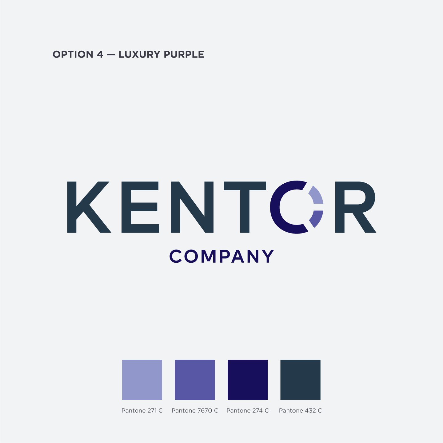
Option 4 — Luxury Purple
By combining the look of Option 2 with the colors of Option 3, we created a version that embraces some of the previous ideas and really stands tall with the stoic look of the luxury brands from our research.
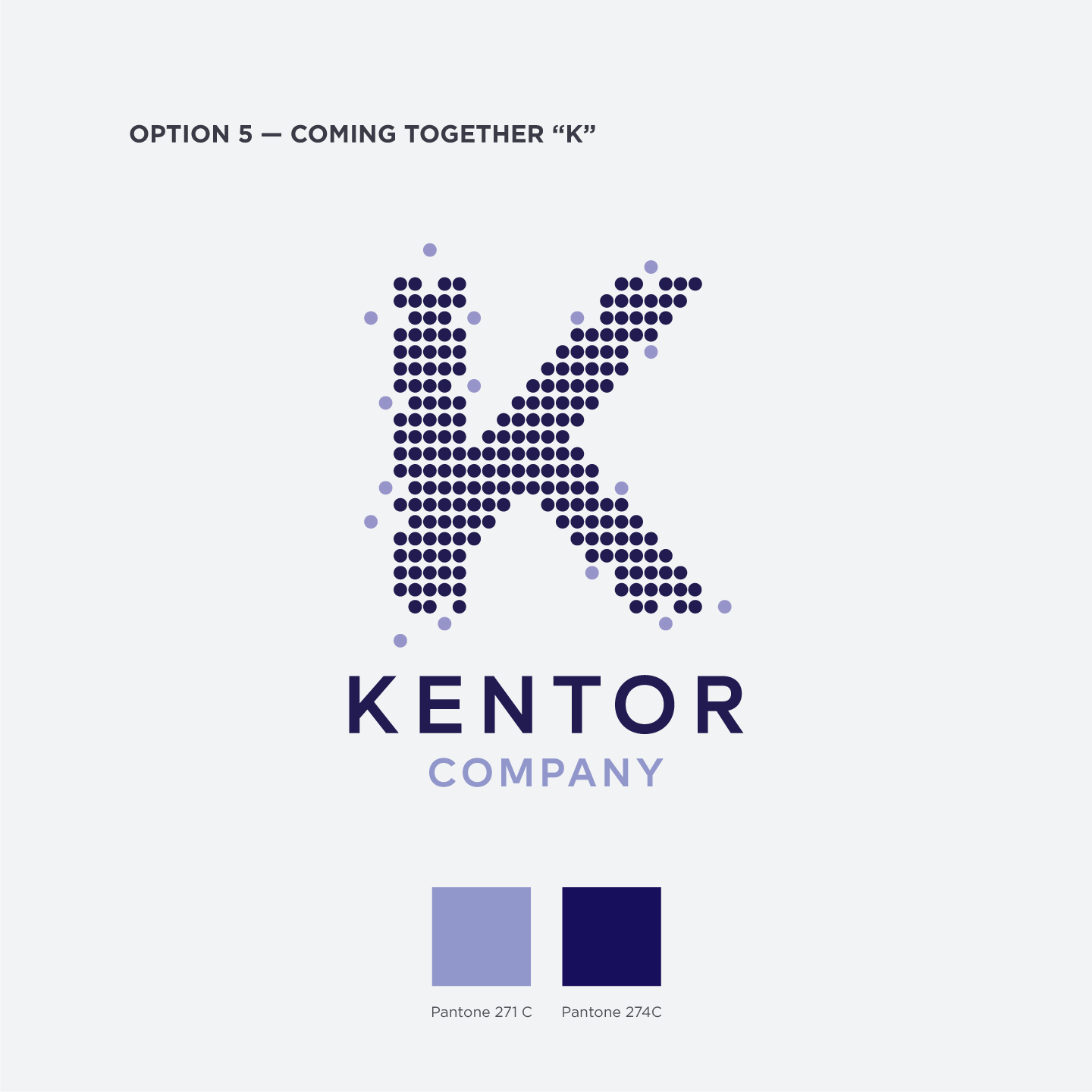
Option 5 — All Coming Together “K”
Even though you requested removing the logo mark, this option’s “K” needed a little more room to work. The pointillistic “K” allows for different color options and implies the motion of all the elements coming together to make the “K,” much like your custom strategy for a client.
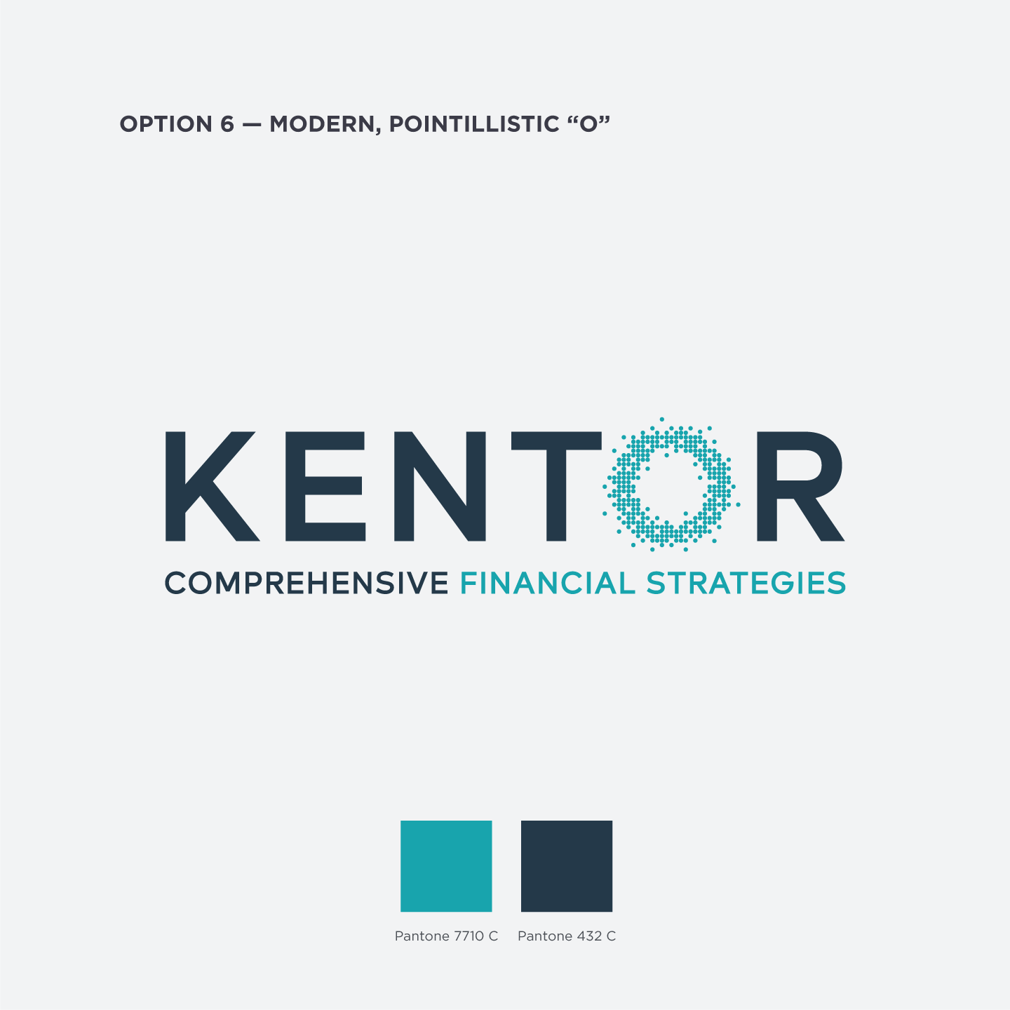
Option 6 — Modern, Pointillistic “O”
In this variation of Option 5, we’ve moved this pointillistic “coming together” into the “O” and shifted the color to teal. There’s a shifting focus between the main logo and the emphasized teal portion that creates depth and interest in this sophisticated version.
Round 2
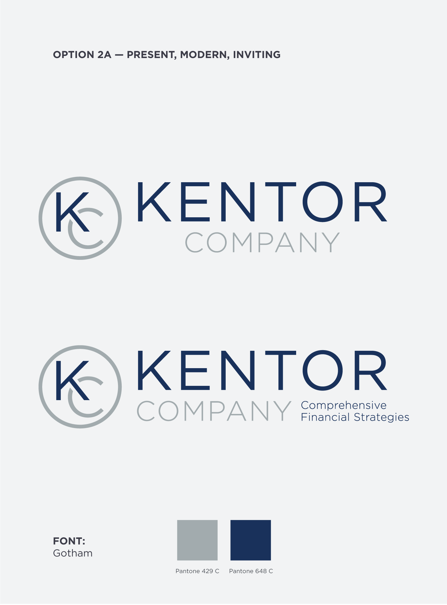
Option 2a — Present, Modern, Inviting
With this updated Option 2, we kept the structural interest and strong logo mark of the original with some subtle tweaks in emphasis. Your eyes are drawn to the right places, and we found balance with and without the shorter tagline.
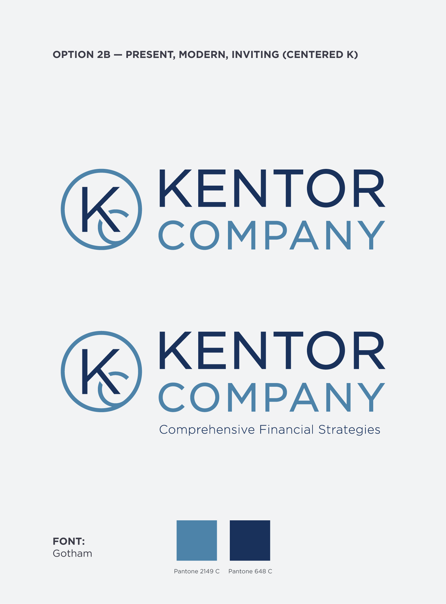
Option 2b — Present, Modern, Inviting (Centered K)
For this second variation on Option 2, we kept much of the original version with two important variations: a lighter typeface and a centered “K” in the logo mark. It preserves (or even maximizes) the symmetry of the original while creating some interesting play in the new logo mark.
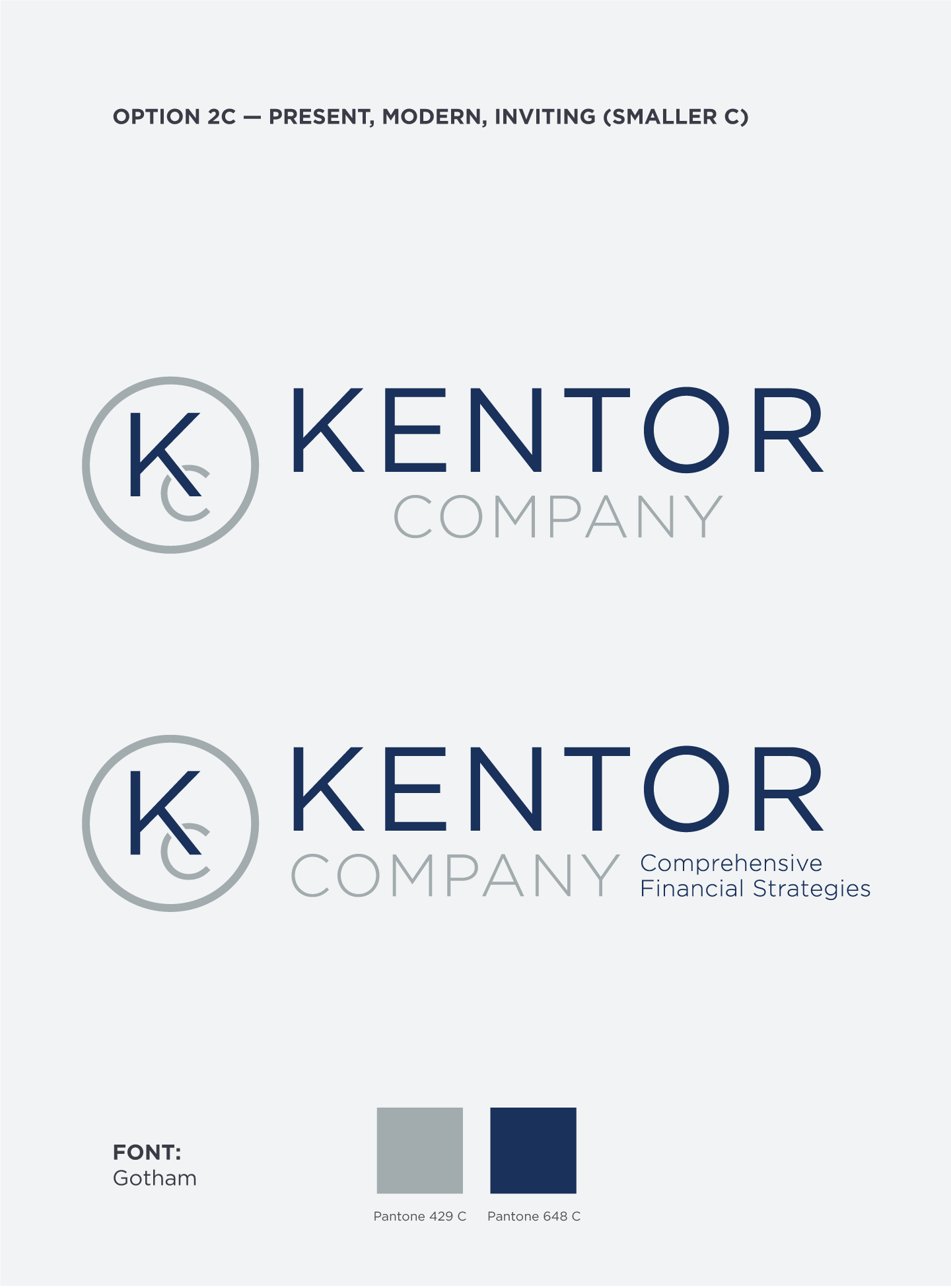
Option 2c — Present, Modern, Inviting (Smaller C)
For this third variation on Option 3, we took the same look of 2a with a smaller logo mark “C.” It has similar color emphasis and broken “C” (to denote it being behind the “K) and draws your eye even more to the “K” in the logo mark.
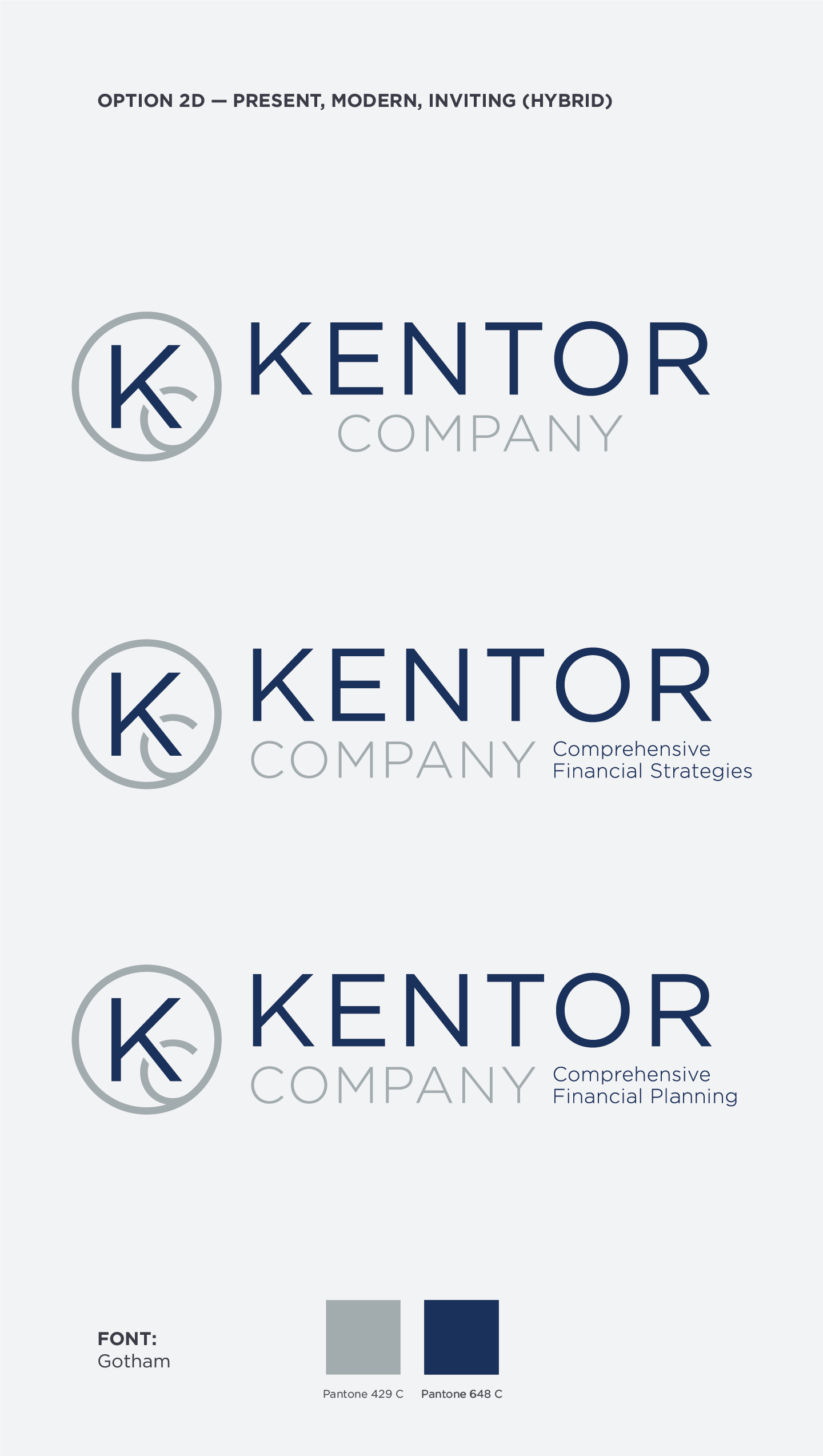
Option 2d — Present, Modern, Inviting (Hybrid)
In this hybrid 4th varation, we kept much of the original version with two important variations: a lighter typeface and a centered “K” in the logo mark. It preserves (or even maximizes) the symmetry of the original while creating some interesting play in the new logo mark. With gray, there’s a strong emphasis on “K” and “Kentor” across the identity.
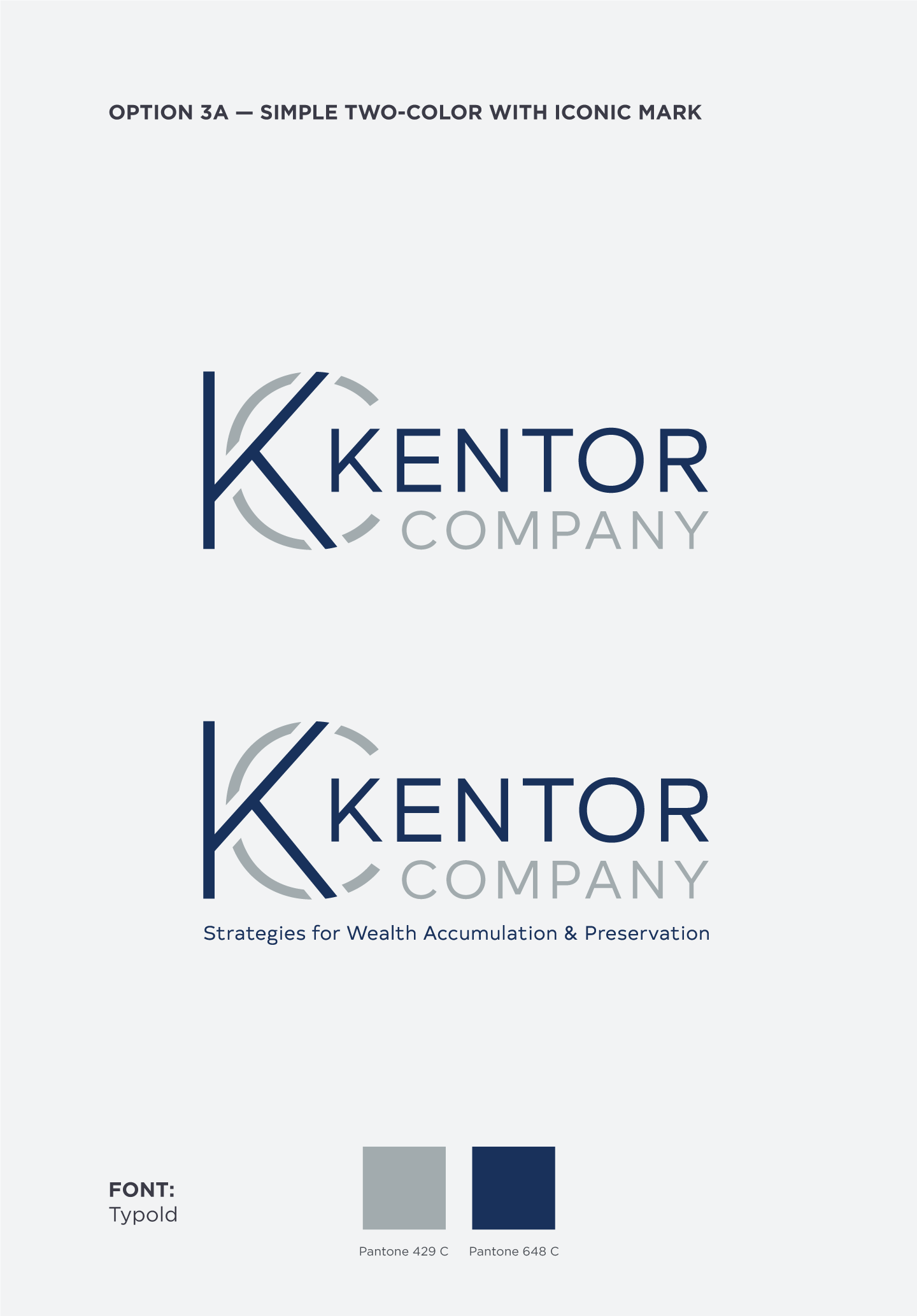
Option 3a — Simple Two-color Logo with Iconic Mark
With Option 3a, we wanted to create a more substantial, stacked version of this sophisticated Option 3. There’s a natural emphasis of “K” and “Kentor” that we enjoyed, and the integrated nature of the logo allow easily for a longer tagline below.
Round 1
With this set of logo options, we present a subtle range between tempered, strong luxury and bold sophistication. The colors and typefaces are muted but solid to signal trust and confidence, and the intermingling of characters, logo fonts and marks, and design geometry subtly suggest the strong bond between you and your clients.
We’ve chosen colors that will fit well with this direction but can offer up additional options if need be. It’s best at this point in the process to choose a single direction from the options below to tweak into your final logo.
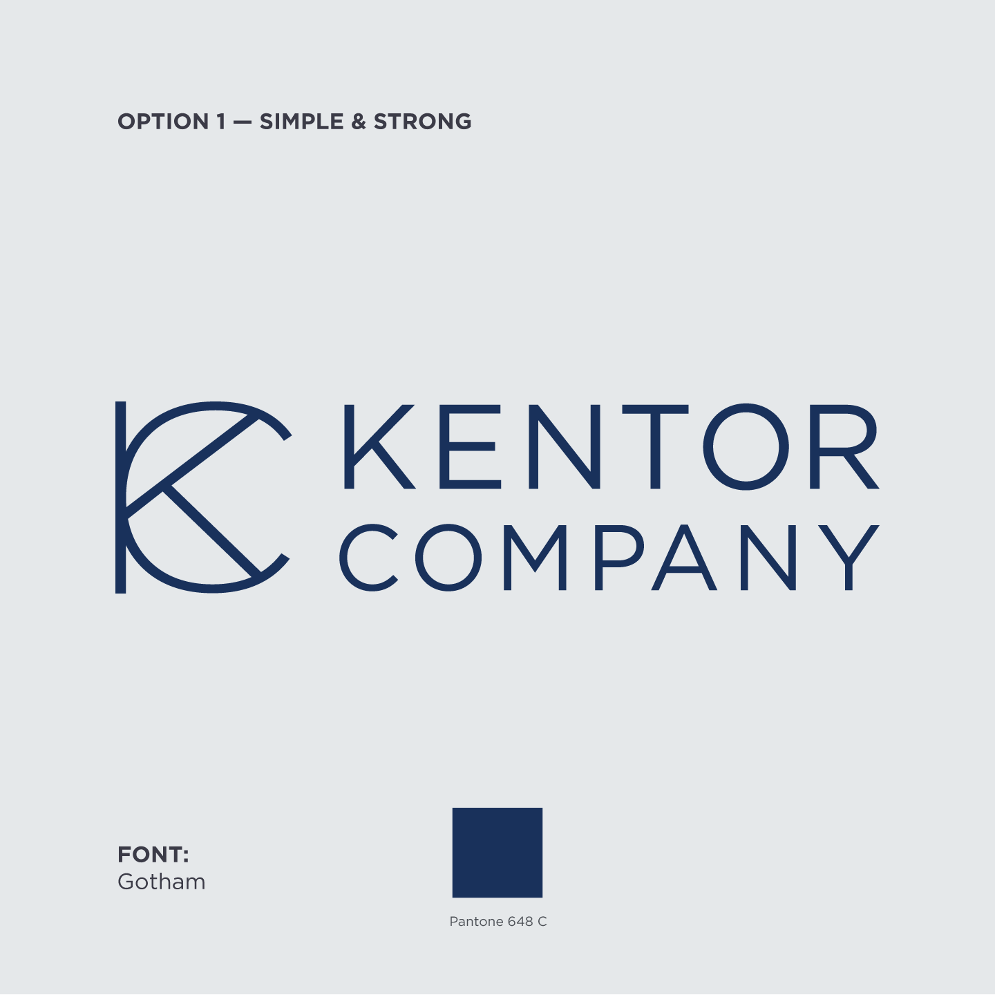
Option 1 — Simple & Strong
Taking our cue from the quietly strong fonts and artfully entangled logo marks of many famous luxury brands, this first option — with its thin but solid lines and beautiful geometry — stands simply and beautifully on a company lobby as well as it does on clean cotton letterhead. The deep Midnight Blue works well like an accent wall mingling easily among whites, grays, and other blues.
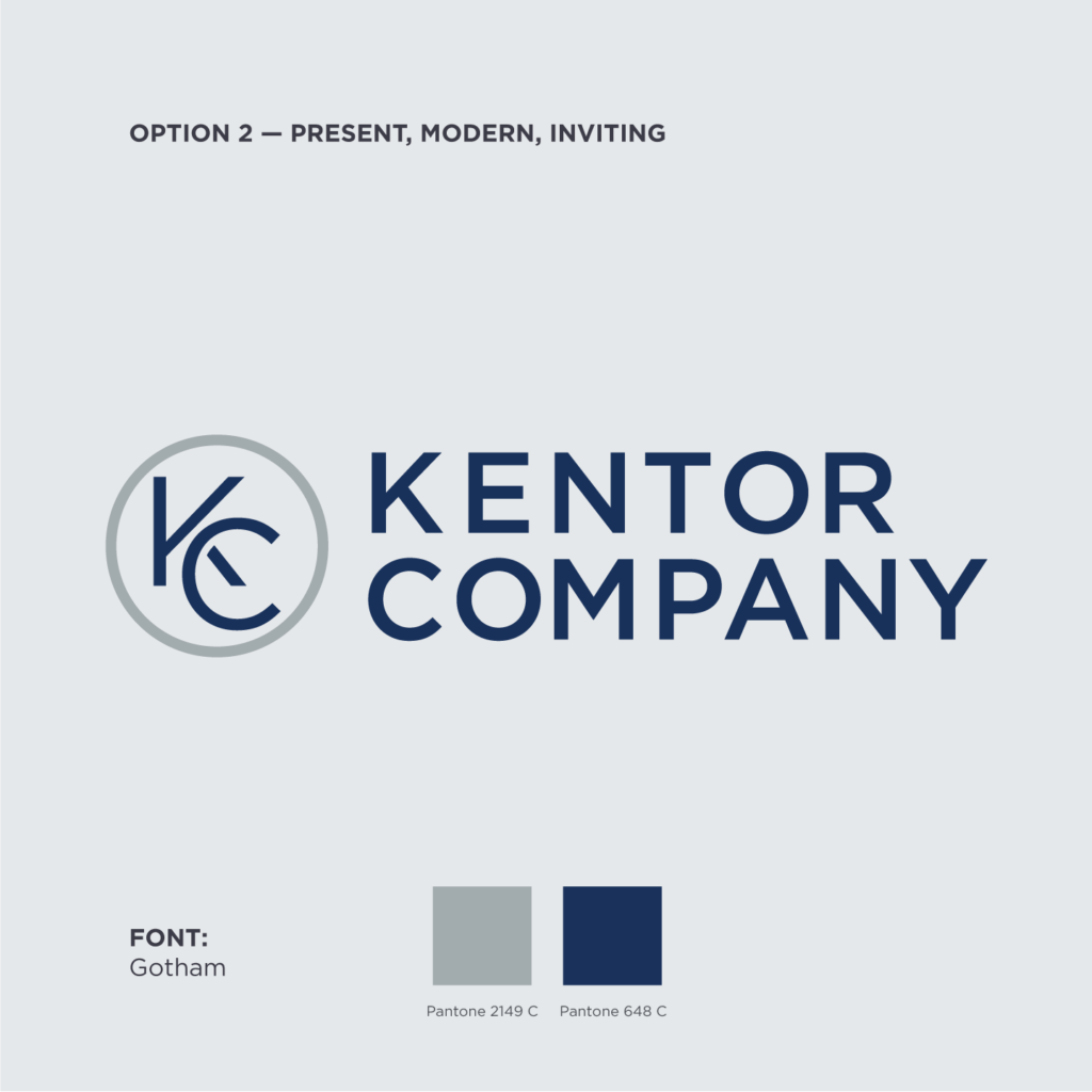
Option 2 — Present, Modern, Inviting
With another take on a quietly strong font meeting an artfully entangled logo mark, this second option explores a bolder play on alignment and symmetry with a sharper, savvier take on the mark. The logo mark can even more concretely stand on its own as an emblem, and it’s difficult to not be drawn to this bold, architectural typeface.
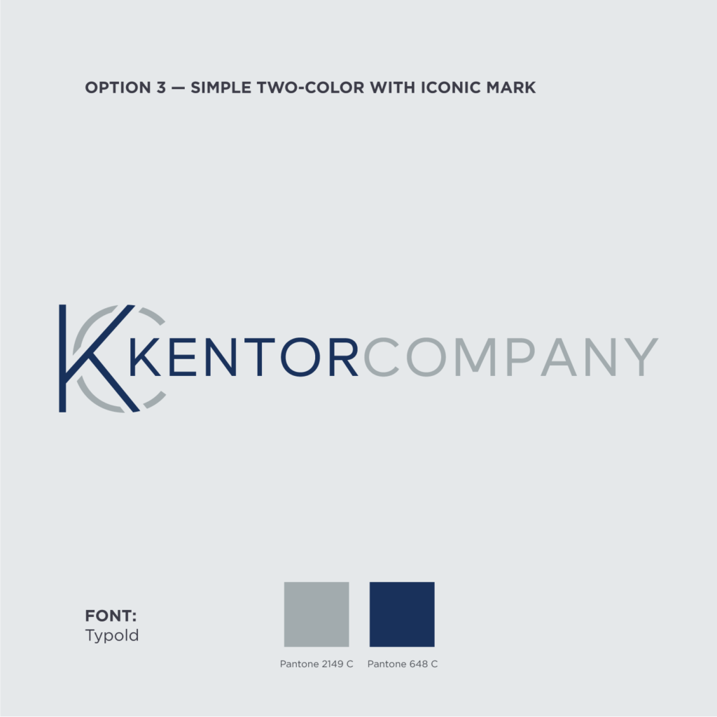
Option 3 — Simple Two-color Logo with Iconic Mark
While we’re often wary of long, horizontal logos, the play of light and dark in this third option really is a lot of fun. The warmth of this type holds up with the change in color across the words, accenting and drawing your eye towards “Kentor” without overshadowing the rest of the design. The alternations of negative space and color across the logo mark “KC” create an amazingly sleek and sophisticated finish to the logo.
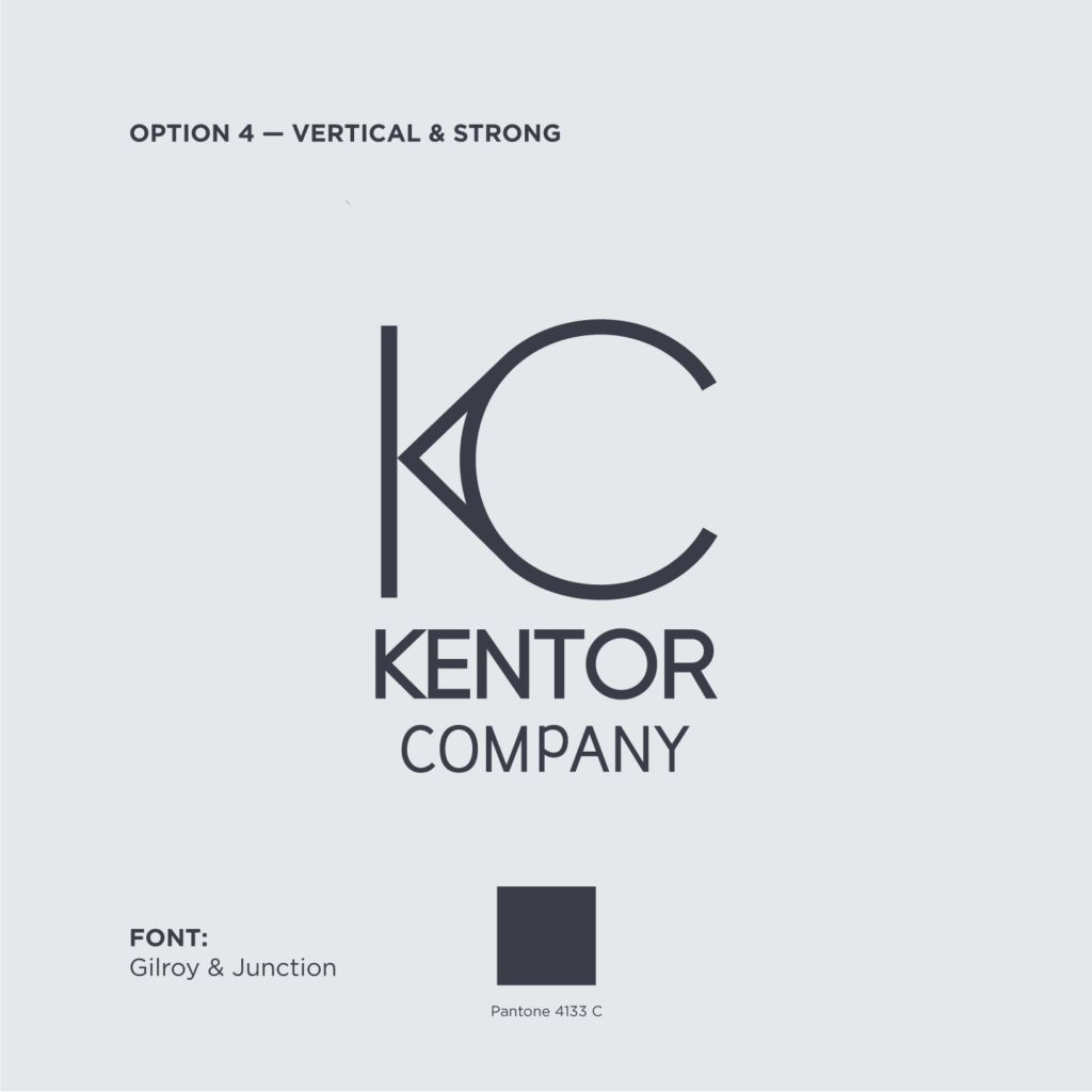
Option 4 — Vertical & Strong
As a vertical option, we wanted to seize upon a bold logo mark that didn’t overshadow the “Kentor” name. Leaning on the simple gravitas you see in Bvlgari’s logo font, we gave this logo a charcoal gray color and enigmatic typeface and mark for a new-but-classic look.
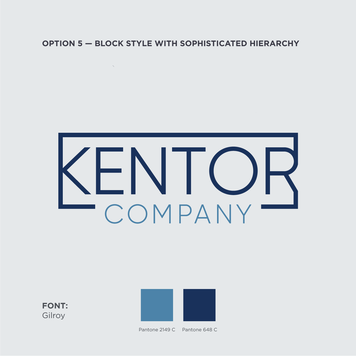
Option 5 — Block Style with Sophisticated Hierarchy
Taking some stylistic queues from your original logo, this option capitalizes on strong glyphs and a fluid framing box. The play between the emphasis of the two words and the Midnight Blue and Wedgewood colors creates a solid sophistication and delicate symmetry, even as the eyes moves across the “R” glyph on the right side.
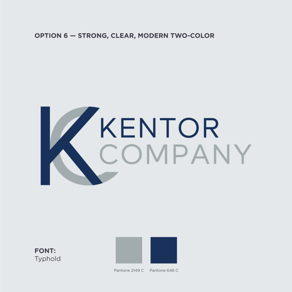
Option 6 — Strong, Clear, Modern Two-color
We traded the box in for another intriguing “KC” logo mark for option six. Despite the lack of symmetry in this design, we’ve found amazing balance with the logo type nestled in the mark, drawing your eyes to the “Kentor” in the diagonals of the logo mark “K.” The visual interest created by the thick lines of the logo mark “KC” will work beautifully on their own.
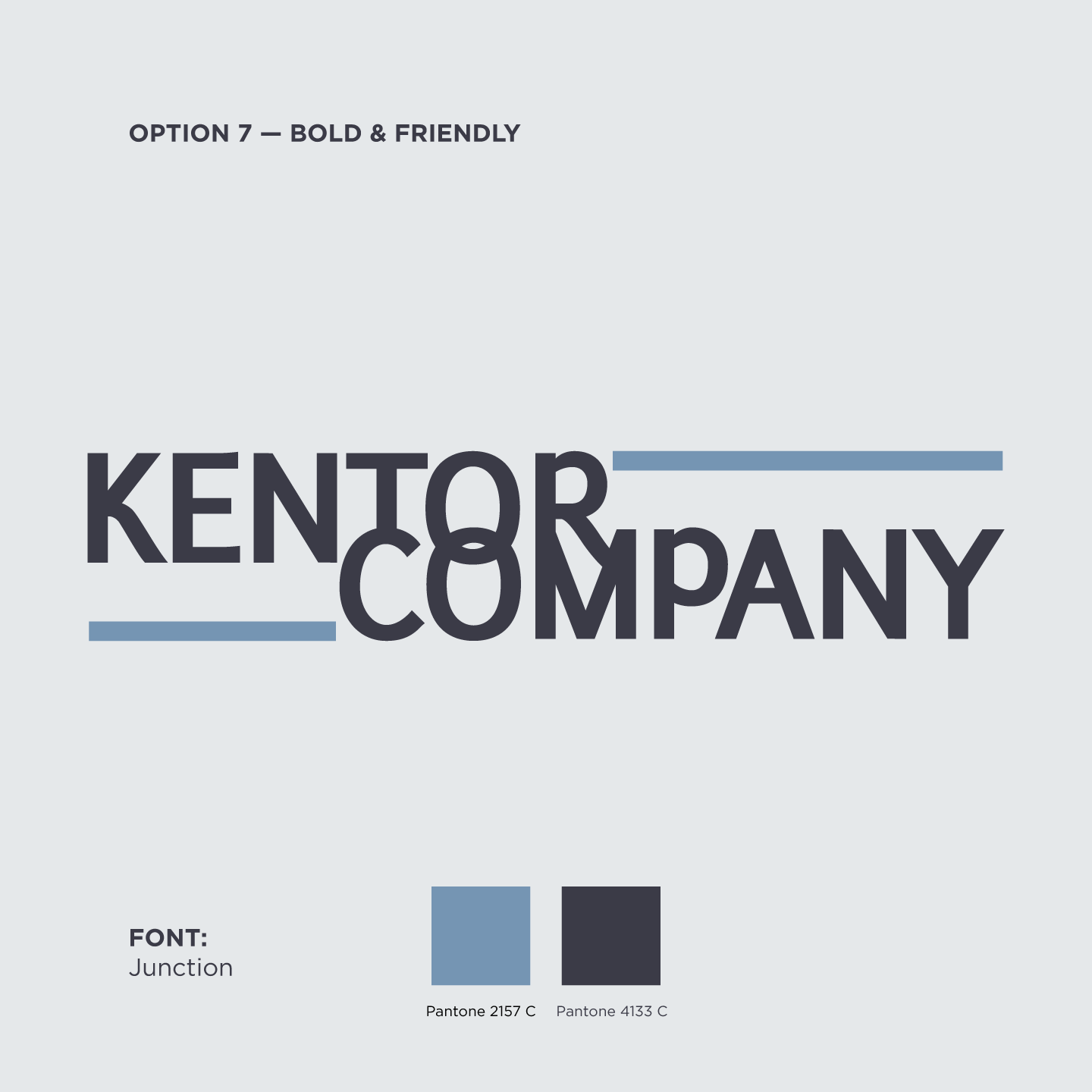
Option 7 — Bold & Friendly
As a final option, we wanted to deliver something slightly more traditional with a bit of structural interactivity and asymmetry to keep it interesting and modern. The interactions between the glyphs in the center of the design create a quirkiness inspired by your original brand. Though there’s a fair amount of rhythm and activity across the design, it’s still quite legible and framed in by the secondary color lines.